Pantone Announces Color Of The Year For 2022 - Very Peri

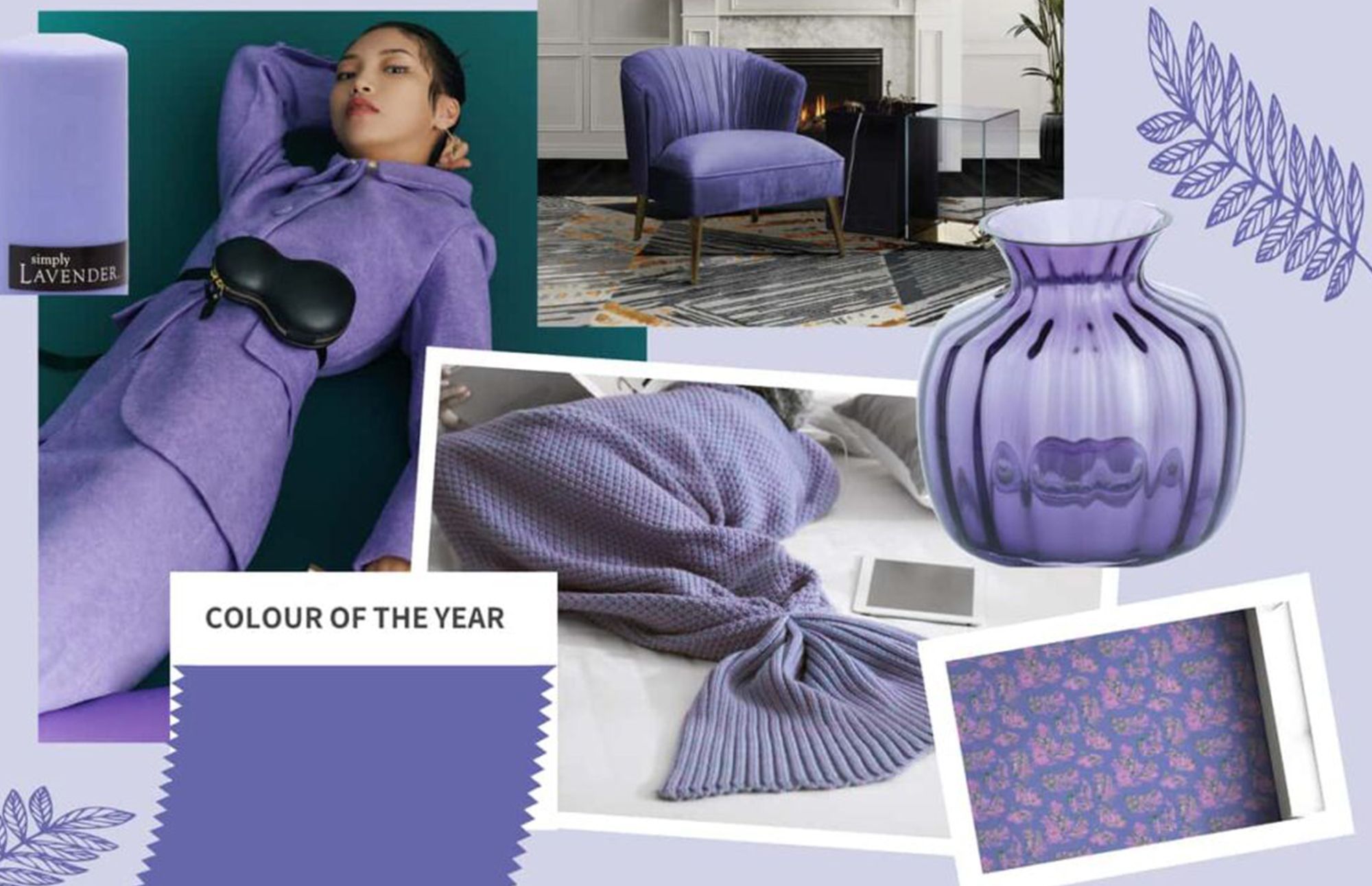
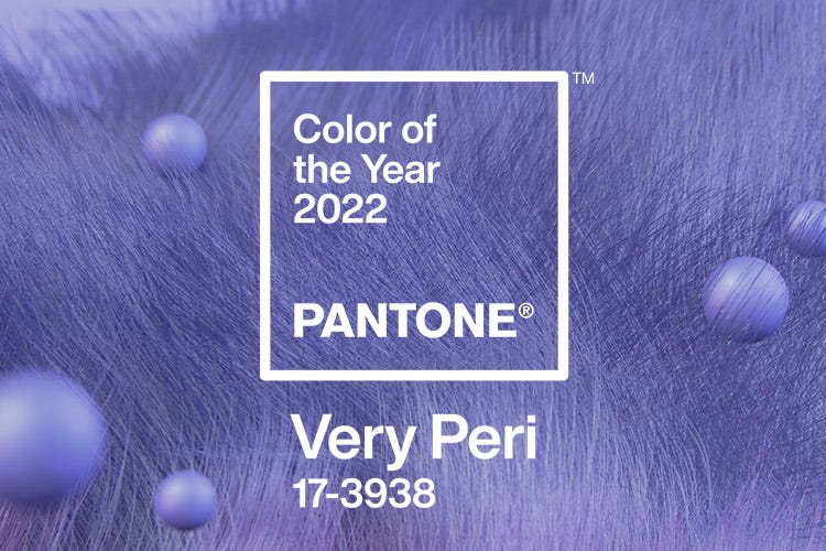
A very happy shade of periwinkle blue, Very Peri, has been chosen for Pantone's Color of the Year for 2022. Very Peri combines the consistency of blue with the energy and excitement of red, creating a warm, happy and empowering new shade. The new Very Peri is the "happiest and warmest of all the blue hues." Rekindling gratitude for some of the qualities that blue represents complemented by a new perspective that resonates today, PANTONE 17-3938 Very Peri places the future ahead in a new light.
According to Pantone, "Very Peri is a symbol of the global zeitgeist of the moment and the transition we are going through. As we emerge from an intense period of isolation, our notions and standards are changing, and our physical and digital lives have merged in new ways." Very Peri illustrates the fusion of modern life and how color trends in the digital world are being manifested in the physical world and vice versa.

The Pantone Color of the Year selection process requires thoughtful consideration and trend analysis. To arrive at the selection each year, Pantone’s color experts at the Pantone Color Institute™ comb the world looking for new color influences. These can include the entertainment industry and films in production, traveling art collections and new artists, fashion, all areas of design, popular travel destinations, as well as new lifestyles, playstyles, and socio-economic conditions. Influences may also stem from new technologies, materials, textures, and effects that impact color, relevant social media platforms and even upcoming sporting events that capture worldwide attention. For 23 years, Pantone’s Color of the Year has influenced product development and purchasing decisions in multiple industries, including fashion, home furnishings, and industrial design, as well as product packaging and graphic design.
